Software Design Engineer for @SonicFoundry. C# dev by day, LAMP dev by night.
6 stories
·
2 followers

Longest Sunset

11 Comments and 22 Shares

Longest Sunset

What is the longest possible sunset you can experience while driving, assuming we are obeying the speed limit and driving on paved roads?

—Michael Berg

To answer this, we have to be sure what we mean by “sunset".

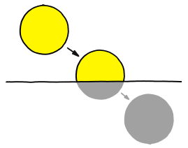
This is a sunset:
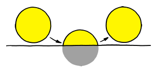
This is not a sunset:
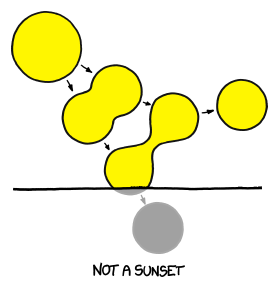
For the purposes of our question, this is not a sunset:

This is also not a sunset:
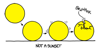
This is definitelynot a sunset:
And no matter what happens here, this will not be a sunset:
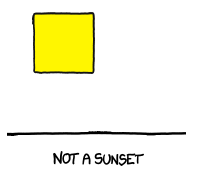
Sunset starts the instant the Sun touches the horizon, and ends when it disappears completely. If the Sun touches the horizon and then lifts back up, the sunset is disqualified.

For a sunset to count, the Sun has to set behind the idealized horizon, not just behind a nearby hill. This is not a sunset, even though it seems like one:
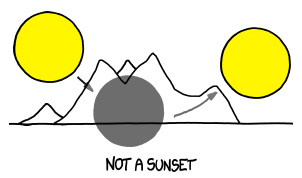
The reason that can’t count as a sunset is that if you could use arbitrary obstacles, you could cause a sunset whenever you wanted by hiding behind a rock.

Note: We also have to consider refraction. The Earth’s atmosphere bends light, so when the Sun is at the horizon it appears about one Sun-width higher than it would otherwise. The standard practice seems to be to include the average effect of this in all calculations, which I’ve done here.

At the Equator in March and September, sunset is a hair over two minutes long. Closer to the poles, in places like the London, it can take between 200 and 300 seconds. It’s shortest in spring and fall (when the Sun is over the equator) and longest in the summer and winter. at the solstice and equinox.

If you stand still at the South Pole in early March, the Sun stays in the sky all day, making a full circle just above the horizon. Sometime around March 21st, it touches the horizon for the only sunset of the year. This sunset takes 38-40 hours, which means it makes more than a full circuit around the horizon while setting.

But Michael’s question was very clever. He asked about the longest sunset you can experience on apaved road. There’s a road to the research station at the South Pole, but it’s not paved—it’s made of packed snow. There are no paved roads anywhere near either pole.

The closest road that really qualifies is probably the main road in Longyearbyen, on the island of Svalbard, Norway. (The end of the airport runway in Longyearbyen gets you slightly further, although driving there might get you in trouble.)

Longyearbyen is actually closer to the North Pole than McMurdo Station in Antarctica is to the South Pole. There are a handful of military, research, and fishing stations further north, but none of them have much in the way of roads; just airstrips, which are usually gravel and snow.

If you putter around downtown Longyearbyen (get a picture with the “polar bear crossing” sign), the longest sunset you could experience would be a few minutes short of an hour. It doesn’t actually matter if you drive or not; the town is too small for your movement to make a difference.

But if you head a little ways south, you can do even better.

If you start driving from the tropics and stay on paved roads, the furthest north you can get is the tip of European Route 69 in Norway. There are a number of roads crisscrossing northern Scandinavia, so that seems like a good place to start. But which road should we use?

Intuitively, it seems like we want to be as far north as possible. The closer we are to the pole, the easier it is to keep up with the Sun.

Unfortunately, it turns out keeping up with the Sun isn’t a good strategy. Even in those high Norwegian latitudes, the Sun is just too fast. At the tip of European Route 69—the farthest you can get from the Equator while driving on paved roads—you’d still have to drive at about half the speed of sound to keep up with the Sun. (And E69 runs north-south, not east-west, so you’d drive into the Barents Sea anyway.)

Luckily, there’s a better approach.

When the Sun is near the horizon in northern Norway, the terminator (day-night line) moves across the land in this pattern:
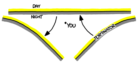
(Not to be confused with the Terminator, which moves across the land in this pattern:)

To get a long sunset, the strategy is simple: Wait for the date when the terminator will just barely reach your position. Sit in your car until the terminator reaches you, drive north to stay a little ahead of it for as long as you can (depending on the local road layout), then u-turn and drive back south fast enough that you can get past it to the safety of darkness. (These instructions also work for the other kind of Terminator.)

Surprisingly, this strategy works about equally well anywhere inside the Arctic Circle, so you can get this lengthy sunset on many roads across Finland and Norway. I ran a search for long-sunset driving paths using PyEphem and someGPS traces of Norwegian highways. I found that over a wide range of routes and driving speeds, the longest sunset was consistently about 95 minutes—an improvement of about 40 minutes over the Svalbard sit-in-one-place strategy.

But if you arestuck in Svalbard and want to make the sunset—or sunrise—last a little longer, you can always try spinning counterclockwise. It’s true that it will only add an immeasurably small fraction of a nanosecond. But depending on who you’re with ...

... it might be worth it.

Read the whole story
cori
4013 days ago
reply
Funniest. WhatIf. Evar.
Madison and Stoughton, Wi
popular
4012 days ago
reply
Share this story
Delete
10 public comments
thameera
4009 days ago
reply
Not everything is a sunset
Sri Lanka
Brstrk
4011 days ago
reply
If the sun suddenly hatched, it still wouldn't be a sunset, but it'd be an AWESOME dawn.
mlapida
4011 days ago
reply
So good.
Houston, TX
Michdevilish
4012 days ago
reply
What If?: Longest Sunset
Canada
lelandpaul
4012 days ago
reply
My new favorite illustration of capitonyms.
San Francisco, CA
tedder
4013 days ago
reply
if it's worth doing, its worth overdoing.
Uranus
roasty
4012 days ago
I am slightly ashamed to say that I looked at your comment and thought, "Wow that's really a great comment. I wish there were a way for me to 'like' this comment" Then I realized that "my liking of a comment adds nothing to it and does not really accomplish anything." Followed by, "Why have I been trained to think that my appreciation of a comment deserves to be expressed." Finally I realized that "if I make this series of thoughts into a reply I would be able to express my enjoyment of your comment while simultaneously exercising my Facebook fueled need to 'like' things."
iiieeeoo
4012 days ago
"Liking" has a purpose. In real life you often express appreciation for things without saying anything, by nodding, smiling etc.. It doesn't add content but it's an important part of casual communication. In text, you don't get that feedback unless people deliberately decide to show it. Sometimes they don't bother, sometimes they do and you get a series of contentless comments. When you can express appreciation with just a click you can do your virtual smile-and-nod with a little less effort and a little less inanity.
Andi_Mohr
4012 days ago
@roasty, try favouriting the comment (click the star). You'll like it.
roasty
4011 days ago
@iiieeeoo I hadn't considered that. Worth thinking about. @Andi_Mohr Interesting. I don't see a star to click.
dreadhead
4011 days ago
I wish you could star/favourite replies...
roasty
4010 days ago
Ah. The star is in the dev interface.
rclatterbuck
4013 days ago
reply
.
beslayed
4013 days ago
reply
//

An Introduction to You

3 Shares

Hello, New Person. It's great to meet you. We've been waiting awhile for you to come here and now that you're here, we're pumped. It's going to be so much better with you here because we've built up impossible expectations in our heads regarding what you can do. Don't worry - we're not going to tell you this because we've got this crazy unique culture where we want you to figure it out all on your lonesome..The journey's the adventure, right?

You'll make mistakes. That's cool, you're in the Bright and Shiny phase of our relationship where you can do no wrong. I mean it, you can't be blamed for screwing up because you're the New Person and you don't know any better. It's our fault, really, because we probably didn't give you the right context or point you at the right wiki page. In fact, it's cool that you made that mistake because failure is how you learn, and boy oh boy, you're sure learning a lot.

. . .

Hello Not-So-New Person. Well, it's been a month and, well, we're really disappointed in you. We think we may have made a mistake.

You remember those expectations we had of you? The impossibly high ones that we never told you about, but mostly just felt? Yeah, they were way off. In fact, our opinions of your ability appear to be way off. You appear to be just a regular old disappointing human. Those mistakes you keep making? We don't know if you're not getting it or what. Most folks have figured it out by now. Figured what out, you ask? You know, the undefinable but very important 'it' that everyone else knows, but can't explain it. You not getting 'it' is worrying us.

This is the Fall from Grace phase, Not-So-New Person. We're disappointed, and the degree of our disappointment is proportionate to our previous impossible and unspoken expectations. We're sad. We're talking to others about your massive failure because we're pretty sure we're going to need to let you go, and talking to others whose unreasonable unspoken expectations were not being met either makes us feel better about the horrible mistake that is you.  

Don't worry. We're going to stick with our longstanding policy of not telling you this because you've still got a little Bright and Shiny, but mostly because we're incapable of articulating our disappointment. We're also a little worried that some of your hyperbolic and unmeasurable failure might rub off on us.

. . .

Hello Person. It's been three months and you're just fine. You've arrived at the final phase of Steady State.

Whew.

We're not sure what we were thinking just a few weeks ago when we were whispering about firing you. You're solid. We've seen you fail and we've seen you succeed. We better understand where your superpower lies. We've stopped thinking of you as a tentative work in progress and now we're just working.

We're sorry.

We're sorry because of everything we didn't say in those first three months of highs and lows. In our enthusiasm, we forget that humans are slow to trust. We forget that we build respect by watching both successes and failures for weeks... for months.

We are in an incredible hurry building important things and have no time for nuance. We're impatient. We're busy. We want everything to move faster, so we make huge, comforting assumptions and slap easy to understand labels on complex concepts.

You are a complex concept. No matter how hard we try to bucket you, there you are, being something we've never seen before.

We're sorry mostly because we always forget these aspects of human nature and each time a New Person, a New Team, or a New Idea arrives, we humans repeat this painful three-month cycle of highly energetic exaggerated expectations, a confusing fall from grace, and a final discovery of comfortable understanding of that which is uniquely you.

Thanks for staying.

Read the whole story
cori
4029 days ago
reply
Madison and Stoughton, Wi
Share this story
Delete

Our Internet Surveillance State

2 Comments and 7 Shares

I'm going to start with three data points.

One: Some of the Chinese military hackers who were implicated in a broad set of attacks against the U.S. government and corporations were identified because they accessed Facebook from the same network infrastructure they used to carry out their attacks.

Two: Hector Monsegur, one of the leaders of the LulzSac hacker movement, was identified and arrested last year by the FBI. Although he practiced good computer security and used an anonymous relay service to protect his identity, he slipped up.

And three: Paula Broadwell, who had an affair with CIA director David Petraeus, similarly took extensive precautions to hide her identity. She never logged in to her anonymous e-mail service from her home network. Instead, she used hotel and other public networks when she e-mailed him. The FBI correlated hotel registration data from several different hotels -- and hers was the common name.

The Internet is a surveillance state. Whether we admit it to ourselves or not, and whether we like it or not, we're being tracked all the time. Google tracks us, both on its pages and on other pages it has access to. Facebook does the same; it eventracks non-Facebook users. Apple tracks us on our iPhones and iPads. One reporter used a tool called Collusion to track who was tracking him; 105 companies tracked his Internet use during one 36-hour period.

Increasingly, what we do on the Internet is being combined with other data about us. Unmasking Broadwell's identity involved correlating her Internet activity with her hotel stays. Everything we do now involves computers, and computers produce data as a natural by-product. Everything is now being saved and correlated, and many big-data companies make money by building up intimate profiles of our lives from a variety of sources.

Facebook, for example, correlates your online behavior with your purchasing habits offline. And there's more. There's location data from your cell phone, there's a record of your movements from closed-circuit TVs.

This is ubiquitous surveillance: All of us being watched, all the time, and that data being stored forever. This is what a surveillance state looks like, and it's efficient beyond the wildest dreams of George Orwell.

Sure, we can take measures to prevent this. We can limit what we search on Google from our iPhones, and instead use computer web browsers that allow us to delete cookies. We can use an alias on Facebook. We can turn our cell phones off and spend cash. But increasingly, none of it matters.

There are simply too many ways to be tracked. The Internet, e-mail, cell phones, web browsers, social networking sites, search engines: these have become necessities, and it's fanciful to expect people to simply refuse to use them just because they don't like the spying, especially since the full extent of such spying is deliberately hidden from us and there are few alternatives being marketed by companies that don't spy.

This isn't something the free market can fix. We consumers have no choice in the matter. All the major companies that provide us with Internet services are interested in tracking us. Visit a website and it will almost certainly know who you are; there are lots of ways to be tracked without cookies. Cell phone companies routinely undo the web's privacy protection. One experiment at Carnegie Mellon took real-time videos of students on campus and was able to identify one-third of them by comparing their photos with publicly available tagged Facebook photos.

Maintaining privacy on the Internet is nearly impossible. If you forget even once to enable your protections, or click on the wrong link, or type the wrong thing, and you've permanently attached your name to whatever anonymous service you're using. Monsegur slipped up once, and the FBI got him. If the director of the CIA can't maintain his privacy on the Internet, we've got no hope.

In today's world, governments and corporations are working together to keep things that way. Governments are happy to use the data corporations collect -- occasionally demanding that they collect more and save it longer -- to spy on us. And corporations are happy to buy data from governments. Together the powerful spy on the powerless, and they're not going to give up their positions of power, despite what the people want.

Fixing this requires strong government will, but they're just as punch-drunk on data as the corporations. Slap-on-the-wrist fines notwithstanding, no one is agitating for better privacy laws.

So, we're done. Welcome to a world where Google knows exactly what sort of porn you all like, and more about your interests than your spouse does. Welcome to a world where your cell phone company knows exactly where you are all the time. Welcome to the end of private conversations, because increasingly your conversations are conducted by e-mail, text, or social networking sites.

And welcome to a world where all of this, and everything else that you do or is done on a computer, is saved, correlated, studied, passed around from company to company without your knowledge or consent; and where the government accesses it at will without a warrant.

Welcome to an Internet without privacy, and we've ended up here with hardly a fight.

This essay previously appeared on CNN.com, where it got 23,000 Facebook likes and 2,500 tweets -- by far the most widely distributed essay I've ever written.

Commentary.

EDITED TO ADD (3/26): More commentary.

EDITED TO ADD (3/28): This Communist commentary seems to be mostly semantic drivel, but parts of it are interesting. The author doesn’t seem to have a problem with State surveillance, but he thinks the incentives that cause businesses to use the same tools should be revisited. This seems just as wrong-headed as the Libertarians who have no problem with corporations using surveillance tools, but don't want governments to use them.

Read the whole story
cori
4038 days ago
reply
important and scary. even if you think you're keeping your private stuff private, you aren't.
Madison and Stoughton, Wi
Share this story
Delete
1 public comment
iainwhyte
4041 days ago
reply
I appreciate the irony of posting this to Facebook. But everyone should read this.
Sydney, Australia

Changes to the Blog

6 Shares

I have made a few changes to my blog that I'd like to talk about.

The first is the various buttons associated with each post: a Facebook Like button, a Retweet button, and so on. These buttons are ubiquitous on the Internet now. We publishers like them because it makes it easier for our readers to share our content. I especially like them because I can obsessively watch the totals see how my writings are spreading out across the Internet.

The problem is that these buttons use images, scripts, and/or iframes hosted on the social media site's own servers. This is partly for webmasters' convenience; it makes adoption as easy as copy-and-pasting a few lines of code. But it also gives Facebook, Twitter, Google, and so on a way to track you -- even if you don't click on the button. Remember that: if you see sharing buttons on a webpage, that page is almost certainly being tracked by social media sites or a service like AddThis. Or both.

What I'm using instead is SocialSharePrivacy, which was created by the German website Heise Online and adapted by Mathias Panzenböck. The page shows a grayed-out mockup of a sharing button. You click once to activate it, then a second time to share the page. If you don't click, nothing is loaded from the social media site, so it can't track your visit. If you don't care about the privacy issues, you can click on the Settings icon and enable the sharing buttons permanently.

It's not a perfect solution -- two clicks instead of one -- but it's much more privacy-friendly.

(If you're thinking of doing something similar on your own site, another option to consider is shareNice. ShareNice can be copied to your own webserver; but if you prefer, you can use their hosted version, which makes it as easy to install as AddThis. The difference is that shareNice doesn't set cookies or even log IP addresses -- though you'll have to trust them on the logging part. The problem is that it can't display the aggregate totals.)

The second change is the search function. I changed the site's search engine from Google to DuckDuckGo, which doesn't even store IP addresses. Again, you have to trust them on that, but I'm inclined to.

The third change is to the feed. Starting now, if you click the feed icon in the right-hand column of my blog, you'll be subscribing to a feed that's hosted locally on schneier.com, instead of one produced by Google's Feedburner service. Again, this reduces the amount of data Google collects about you. Over the next couple of days, I will transition existing subscribers off of Feedburner, but since some of you are subscribed directly to a Feedburner URL, I recommend resubscribing to the new link to be sure. And if by chance you have trouble with the new feed, this legacy link will always point to the Feedburner version.

Fighting against the massive amount of surveillance data collected about us as we surf the Internet is hard, and possibly even fruitless. But I think it's important to try.

Read the whole story
cori
4042 days ago
reply
Madison and Stoughton, Wi
Share this story
Delete

Oh Now Ya Done Make My Brain Explode

1 Comment and 2 Shares
Oh Now Ya Done Make My Brain Explode

Submitted by: Unknown

Read the whole story
cori
4042 days ago
reply
awesome
Madison and Stoughton, Wi
ckittel
4046 days ago
reply
Beaver Dam, WI
Share this story
Delete

A Great UI is Invisible

2 Shares

A Great UI is Invisible

A really well designed user interface is one that goes unnoticed by the user, whereas a poorly designed user interface forces the user to pay attention to it instead of the content. Users come to websites in order to achieve a goal: buy a new book, learn about jQuery, share an article with friends, find new music, write a novel or just find the nearest Target. Users don’t come to play with your interface design. In fact, users don’t care about your interface. For years the desktop paradigm and the lack of interactive tools have made people think about user interfaces, how they work and what makes some designs better or worse; but do we really want our users caring about all this stuff?

Users have become too familiar with user interface patterns and user interface components — a user really doesn’t even want to know or even care to know what these things are. Over the years web designers have spent hundreds if not thousands of hours playing with button colors, drop shadows, borders and gradients in order to make the UI more usable and pretty. But really, the end goal of a great user interface design should not be usable, but invisible.

opencoach_carosel_nav

If you haven’t heard, mobile devices are kind of a big deal these days. The multi-touch device has cracked open the idea that user interfaces are a series of clicks and sequences that allow manipulation of content — mobile devices allow more natural user interaction between the human and the content embedded on the device. These Natural User Interfaces (NUI) are more “natural” for a variety of reasons, but, direct manipulation of content and the lack of antiquated metaphors (the desktop) allow these devices to be super easy to use because their interfaces are almost invisible.

But we still work on desktop and laptop computers, we still view web sites and use web applications that can’t always take advantage of this new, more natural interface design with all the wonderful multi-touchy stuff that makes these devices so much fun to use. So, because we aren’t quite there yet, do we continue to create old, “get in the way” interface components? We shouldn’t. The goal of an invisible interface should be the goal of every UI designer and developer.

UIs, not Hurdles

http://dribbble.com/shots/560911-IMG0007

The user interface shouldn’t be a hurdle to content or the user’s end goal. The user shouldn’t have to jump over UI traps and poorly organized navigations in order to achieve their goals. Over the years we’ve used and invented some real UI hurdles that, on the surface, feel as though they are solving a problem when they are just adding more user burden. The breadcrumb is a great example of this. Often we think a bread crumb is a great way to let the user know where they have been in the app, but that is mostly just an added UI component that is not always necessary in a properly designed user experience.

While the breadcrumb doesn’t directly burden the user, it takes up screen real estate that in most cases should be used to further the user goals and display content. Instead of adding a breadcrumb to overcome a navigation problem, address the navigational problem. Some UI problems are all too often “fixed” by adding a new component, but too many of these unnecessary components start to add up and eventually you have a UI that is riddled with hurdles. How can a UI become invisible when you just keep adding more UI components to it?

Fix the Problem

http://dribbble.com/shots/890759-Ui-Kit-Metro

This really ties into what we just talked about, but building an invisible UI means that you’ll need to solve the deeper problems, you’ll need to actually fix what is broken. I have a little bit of a back problem and sure, popping my back and taking Ibuprofen helps treat the pain, but it doesn’t fix the actual problem; I don’t exercise enough, I tend to slouch and I’m about as flexible as a rock. We do the same thing with UI problems. As we design and build web sites and apps we discover weird things in our sites and interfaces. A lot of the time we just react and throw something superficial on them to fix the problem when most of the time the problem lies somewhere deep down in the interface. We just stop the bleeding.

Generally, ‘stopping the bleeding’ has become the best practice for most of us because we’ve learned to pick our battles with project managers, site owners, stakeholders, time constraints or just plain laziness. We tend to right that off as a way to do some user or AB testing “Well, I know it’s got some issues but we’ll see if they are real problems when we user test.” That might not be the best approach if we are trying to design for invisibility. Having a completely transparent interface means solving those deeper design and user issues so that they don’t rear their ugly heads and become hurdles for users to trip over.

Design for Forgiveness

http://dribbble.com/shots/731563-Music-player

An attribute of an invisible interface is that it’s generally very forgiving. Natural user interfaces are more open to exploration by the nature of touch, they are also less prone to throw errors when the user finds a dead end and more prone to give a user another direction.

Forgiving the user means that we don’t punish them when they make mistakes. User mistakes are more often the result of the user not knowing what to expect. We tend to blame the user for making mistakes and we punish them with big warnings and errors. A more invisible UI refrains from punishing the user when they fall into a trap. Rather than displaying an error, a well designed UI predicts where there is a higher chance of user error in the app and provides a way for the mistake to be resolved or even deflected.

Forgiveness also means that the site or app allows the user to break it. It’s a cheesy thing, but the most valuable lesson is the one learned after you broke your Mothers antique vase, glued it back together and then got caught because you glued your fingers together doing so. The user learns more about the app when they are allowed to fix their mistakes if they make them — hopefully without a big red error icon and some poorly written, non-readable text.

Goals First

http://dribbble.com/shots/825856-Bobo-Profile-Page

This is pretty much just interaction design 101, it’s a Cooper building block, but since it still doesn’t seem to happen much I think it warrants a little mention — goal-oriented design. Your user interface should be designed around the goals of the users. Not what the user wants or what the user prefers, hell, it’s not even about what you want or what you would prefer, it’s about discovering the user needs to accomplish and meet the expectations by getting them there. It’s funny, users have a great idea on what they want to use, but they really don’t have any idea of what they need. It’s your job to figure out the need not the want. The ‘want’ just creates bloated, hurdle ridden interfaces that just annoy the user.

Find out the goals and allow your user to get there as quickly as possible, they don’t really care about anything else so if you can get them to their destination as quickly as possible that is reward enough. You don’t need to design some pretty interface if the user can quickly achieve their goal. Avoid over designing the UI to compensate for poor goal oriented design.

Real Consistency

http://dribbble.com/shots/510911-Inside-Photo-album-iPad-UI-UX-iOS

Okay, so in the UX world, we talk about consistency a lot and rightfully so. Consistency is a big deal when it comes to interface designs. If your UI components are all in the same place, have the same color and function the say way then your interface will disappear slowly over time… kind of like Marty McFly. But just simply putting all your call-to-action buttons in the same place on every page or calling a particular action the same thing through the app might not solve the consistency problem.

Another thing we tend to do in UX design is use constant and familiar things from other apps or sites in our own apps. I’ve written about this in the past about how familiar surroundings can make an interface more comfortable. But when we are trying to accomplish an invisible interface design than instead of being consistent for consistency’s sake might still not be good enough. An invisible interface has “real consistency“, meaning that not only are components, values, links, and other data presented consistently throughout the app, they are also consistent in context and meaning.

For example, you may notice that a lot of other apps put the login button or link in the top right corner of the app and so you just figure since other more popular apps use it, it can’t be bad. But maybe in your app it doesn’t make sense to have it there. Instead of continuing to build a flawed interface, put your components where they belong in your app and then continue the consistency of that throughout the app.

Conclusion: Inspire the User

The last thing any really well designed and completely invisible interface should do is inspire the user. When the user interface gets out of the user’s way and simply directs them to what they need, the user can focus on the their goals for using the application.

Interfaces should provide seamless interactions with the data and content and inspire the user to build a better relationship with it. Users do enjoy navigating a clever UI and in some cases have fun using them, but most often a user is inspired by an interface that isn’t there at all.

Read the whole story
cori
4042 days ago
reply
Madison and Stoughton, Wi
ckittel
4045 days ago
reply
Beaver Dam, WI
Share this story
Delete